Old Friends

Visual Literacy Final Video Project

Details:   Mood Piece/Narrative

Plot:      Mood piece that will focus on loneliness. A big problem a lot of students will be facing next semester is being alone, whether their friends are studying abroad or the individual is going abroad. The mood they will feel within those first few weeks of not having a friend is what I’m looking to capture on film. Overall, I want to film two guys who are the best of friends and investigate the dramatic shift in their dynamics from being brothers to only being connected through social media. In addition, I want to set up a plot that shows how this separation affects each friend but neither is willing to acknowledge how much this separation has impacted their lives. In order to establish the mood, I plan to use different kinds of lighting to portray the mood of the individual and then switch the lighting to show how the other friend interprets their mood. There will be dialogue in this piece and some background music to set the mood. In the end, I want the audience to understand that the mood of the piece is feeling alone after being separated from people who are ideally your family.

Music:     I Want To by Best Coast

Actors:    Tom O’Connor — Friend 1    Saeed AlKhaja — Friend 2

Director:  Leonardo Almanza

Scene Breakdown: First scene is of their last night out. Scene starts with few shots of them together and close up shots of a computer open to Facebook into a shot of the cathedral/sunset. Tom is alone in the apartment bored and playing COD waiting for Saeed to text him back. Tom goes on Facebook and sees that Saeed went to a party (OTS into close up of screen to extreme close up of Tom’s face). Saeed tries to Skype Tom but Tom fell asleep studying. (OTS shot and close up + wide shot of apartment being empty and alone). Comparison shots of their empty apartments to show that they’re alone (Mix of wide shots and close up shots). Final scene of them reuniting over coffee and seeing the difference in their dynamic (OTS and medium wide shot).
Final Project Idea

For the final project, I am doing a mood piece that will focus on loneliness. A big problem a lot of students will be facing next semester is being alone, whether their friends are studying abroad or the individual is going abroad. The mood they will feel within those first few weeks of not having a friend is what I’m looking to capture on film. Overall, I want to film two guys who are the best of friends and investigate the dramatic shift in their dynamics from being brothers to only being connected through social media. In addition, I want to set up a plot that shows how this separation affects each friend but neither is willing to acknowledge how much this separation has impacted their lives. I want to start the video by showing the close bond on a final night out and then filming each one of them leaving, or staying, in the place that they will spend the next few months apart. I want to capture the feeling of seeing your best friend having fun without you on camera and show how much being without your friend is tearing you apart. This will be done by showing one of the friends at a party where they are miserable but the take a group picture in which they seem to be having a good time. Afterwards, the other friend sees the photo on Facebook and reacts to seeing his friend having fun without him. Another important scene will be missed connections or interactions, which is going to be portrayed when one of the guys forgets to Skype the other after studying all night. In order to establish the mood, I plan to use different kinds of lighting to portray the mood of the individual and then switch the lighting to show how the other friend interprets their mood. There will be dialogue in this piece and some background music to set the mood. In the end, I want the audience to understand that the mood of the piece is feeling alone after being separated from people who are ideally your family.

Visual Review: Portrait of Mnonja

2011.16_1a


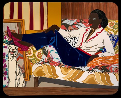
The “Portrait of Mnonja” by Mickalene Thomas is made out of unconventional materials such as rhinestones, acrylic, and enamel on panel. The image itself evokes power through the lines of her pose and the glare on her face. The different elements create lines throughout the painting, specifically on the pants to show the different highlights that the light created when Thomas constructed this portrait. The rhinestones are used to create the highlights on her pants, in addition to highlighting the eye shadow on the lid of her eye. This draws attention to the stare on her face that leaves the viewer wondering if she is angry or focused. Another part of the portrait that incorporates the rhinestones is the heels, which adds a glitter effect to the shoe and highlights the contrast between her beautiful skin tone and the radiance of the shoe. Another important aspect of the image is the red lip she has painted on her face, which contrasts against her bold skin tone. In addition to highlighting the lines in the pants in this painting, the lines in her hair are also highlighted using the eccentric materials. An important part of the photo is the different patterns that Thomas incorporated. Although the patterns do not match, they work cohesively to create a dynamic image and enhance the power in the photo. The pattern contrast against her solid colored outfit to show the strength of her pose and the elegance, specifically in her right hand. The different aspects of the portrait would clash if Thomas did not use the materials she selected for this portrait. Overall, the dynamic use of color really propels the image and adds a soft edge to this powerful portrait. One aspect of the painting I did not enjoy was the wood paneling in the back of the photo. Although it adds another pattern, it does not work well with the other prints as it should. Overall, Thomas used abnormal materials to create a regal and striking portrait of Mnonja provoking thought and wonder as to why she has such a pensive gaze in this painting.

PAINTING TO LIFE: Portrait of Mnonja

First Shot (Medium Wide Shot 0:11): The first shot of her walking into her apartment after work while talking on the phone with her friend asking if they are going out that night. She sounds excited because friend says yes.

Second Shot (Wide shot 0:16): The second shot is of her picking clothes out of her closet.

Third Shot (Close Up/Humor 0:31): She is applying makeup in the fourth shot, specifically red lipstick.

Fourth Shot (Extreme Close Up 0:45): The fifth shot is her texting friend if they’re on their way.

Fifth Shot (Close up 0:51): A shot of running water pouring into a cup.

Sixth Shot (Extreme Close up 0:58): She puts the glass cup down with red lipstick on the rim.

Seventh Shot (Extreme Close Up 1:02): She reapplies the red lipstick.

Eighth Shot (Wide Shot 1:12): She is relaxing on the couch watching television while sitting up and dressed up waiting for her friend to reply.

Ninth Shot (Over the Shoulder/Close Up 1:19): She receives a text from her friend replying that they cannot make it.

Tenth Shot (Wide Shot/Frustration 1:23): A shot of her resting her hand on her knee and looking disappointed while dressed up on couch.

Final Shot is of the painting coming to life (1:29).

Visual Review: The Sounds

TS1

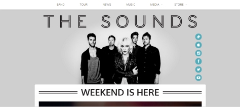
The website for the Sounds has a simple clean design that is both user friendly and visually appealing. The homepage has links to their various social network sites on the side of a group photo of the band. The icons used for these links are simple and contain logos for each of the website the icons link users to. Overall, the links are efficiently designed and provide a perpendicular line to the title of the website, which is the bans name. The group photo on the top of the homepage is centered on the lead singer and does not distract the user from the simplistic design incorporated throughout the website. The photo itself is cropped and layered over the page so that the background of the photo is the background of the homepage. Another nice feature is the links to other pages of the site, such as the band information, tour information, news, and much more. The text that is used for the site, specifically the links to other pages, adds onto the recurring theme of simplicity seen throughout website.

TS2

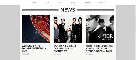
The news page has the recurring theme but it is changed a bit by adding a banner that separates the content from the top of the webpage. The news is laid out simply with links and dates clearly displayed for users.

TS3

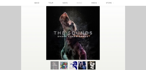
The music page has images of the album covers for each album. This clean design makes adds to the minimalism of the band’s website. When an album cover is clicked, it redirects the user to another page that displays information on the album and a few sample tracks. I enjoyed seeing this because it allows the user to preview the album before deciding to purchase it.

TS4

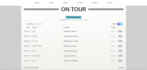
The tour page takes a minimalist approach like the other pages but it seems drab and tired. The color theme of the text gets lost in the background layers and does not pop against the effortless design. This is the only aspect that I found to be a problem with the website. Overall, the website is great and the minimalist approach makes the navigation simple for users. The only problem was the text used for the tour dates because the color made the dates look tired and boring.

Self Portraits

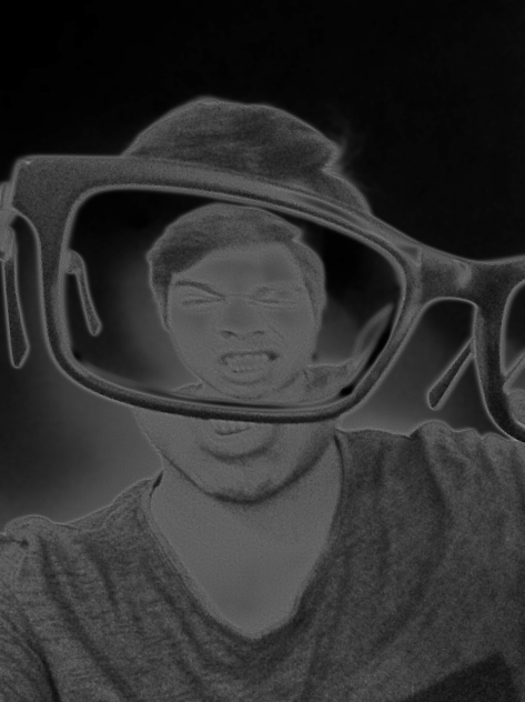
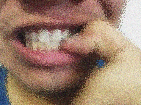
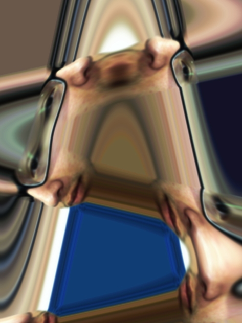
For  my self portraits, I chose to focus on various things about myself that used to make me feel insecure at some point in my life: my glasses, my compulsive nail biting, and my wide nose.

Glasses

Glasses: I made the photo black and white, then I added the artistic filter Neon Glow.

Nail Biting

Nail Biting: I first added the filter Ocean Ripple to make it seem like my mouth was chattering and then I added noise to make the ripples more fine.

Nose

Nose: I first decreased the brightness and increased the contrast. Afterwards, I blurred my face and Distorted the photo using wave to focus on my nose.

Word Photo: Motion

photo

For motion, I chose to take of photo of moving water because of the ability to capture the different dynamics of movement of this element in one frame. A few examples of these different dynamics are the fluidity at the top of the rock that changes into chaotic crashing at the bottom. The water eventually settles and becomes fluid once again at the bottom left corner of the image.

Visual Review: Title Sequence to Season 1 of Weeds

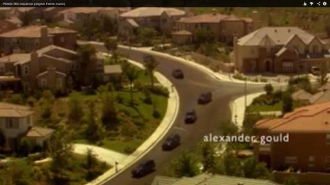
The title sequence for Jenji Kohan’s critically acclaimed series Weeds is one of the most recognizable title sequences in HBO history because of its background song and the recurring theme seen throughout the various seasons of the show. The title sequence of the first season focuses on symmetry and repetition to show the theme seen in suburban lifestyle. Like other seasons, the title sequence to Weeds provides some type of hint as to the theme of the season. The camera moves used in the title sequence emphasizes all of these hints as to what the theme of the season is going to be. The variety of wide shots used in the title sequence allows the director to show the repetition seen in the suburban neighborhood of Agrestic, CA. The best shot in my opinion is the high angle, extreme wide shot of the same SUV pulling out of every single home in the neighborhood at the same time.

1

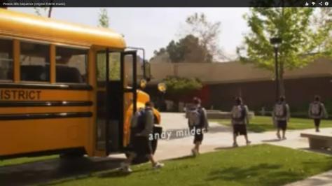
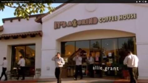
Another important part of the title sequence is the shot of the children walking in a symmetrical line and then the shot that follows of the adults walking in a line of symmetry. This says a lot about the destiny of these children, in addition to providing visual representation of symmetry. Another aspect of these shots is the use of diagonals, specifically how the shot of the adults create three sections to emphasize the rule of thirds.

2

3


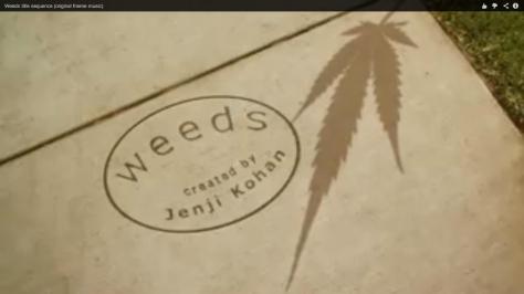
The most important shot in the title sequence is the final shot that shows the marijuana leaf growing and creating a shadow on the pavement of the suburban neighborhood. This explains the plot of the show without directly stating what the show is about. In addition, the director utilizes empty space to focus on the title of the show and the creator of the show. Another important aspect to this shot is the lack of symmetry seen in all of the other shots of the title sequence. This shot does not follow any real rules of camera angles and object placement, in addition to having a tilt for no real reason.

4

Overall, the title sequence of the show Weeds utilizes various camera moves to show various themes seen throughout the first season of this show.

Visual Review: Prometheus


The movie poster for the film Prometheus, which is directed by the critically acclaimed Ridley Scott, contains several different techniques. The poster uses two objects in the form of a person and a giant statue in the shape of a head. The difference in the sizes of the objects creates a scale as to show the viewer that the human in the poster has found something bigger than life itself. In addition, there is little to no lighting present and it creates a silhouette of the small human by using backlight provided by what seems to be a flashlight. This allows the viewer to focus on the larger object rather than the smaller person in the foreground of the poster. The use of light also emphasizes the dark undertones of discovering this large statue and makes the viewer question whether or not the discovery is detrimental to this person’s safety. Another important aspect to the photo is the texture created by using the low lighting because the texture is created by the shadows of the grooves in the statue. If more lighting was to be incorporated in the shot, the texture would be lost and the ominous feeling created by the shadows near the eyes and lower parts of the head would be completely lost in the shot. Another important aspect of the lighting and the silhouette created by this lighting is that it hints at the costume used by the smaller subject in the front of the photo. It subtly lets the viewer know that the film takes place in space and the future by displaying the silhouette of a person in a space suit. In addition, the lighting leaves question for whether the person in the foreground is male or female, which leaves a lot to the imagination of the viewer. Overall, the poster uses camera and lighting techniques wisely to give the viewer subtle clues as to the premise of the film without revealing any major spoilers or turning points that would ruin the viewer’s experience of the film. One thing that does not come off to well is the limited amount of empty space in the photo because if it were used a little bit more near the name of the director of the film, the lettering would standout more efficiently against the lit fog above and behind it. In summary, the poster uses techniques and camera moves efficiently to draw in viewers without revealing too much.